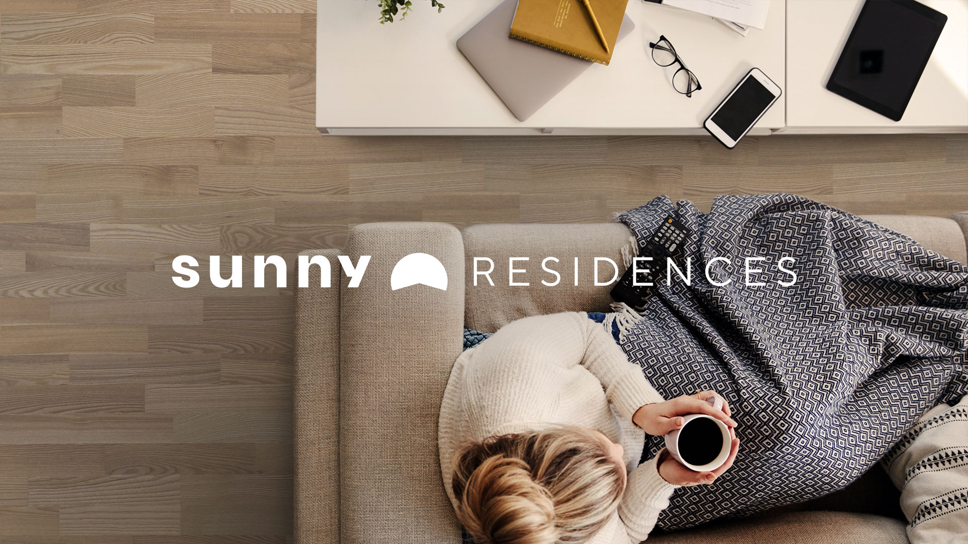
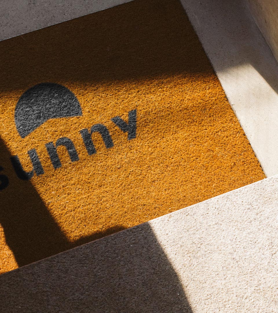
Sunny Residences is a new concept of real-estate agency that also handles the construction and development side of things. From 0 to 100, Sunny Residences aims to have full control over its properties.
I’ve partnered up with them to strategize and design a brand experience that embraces a customer-first approach. One that reflects their core values and beliefs.
Challenge
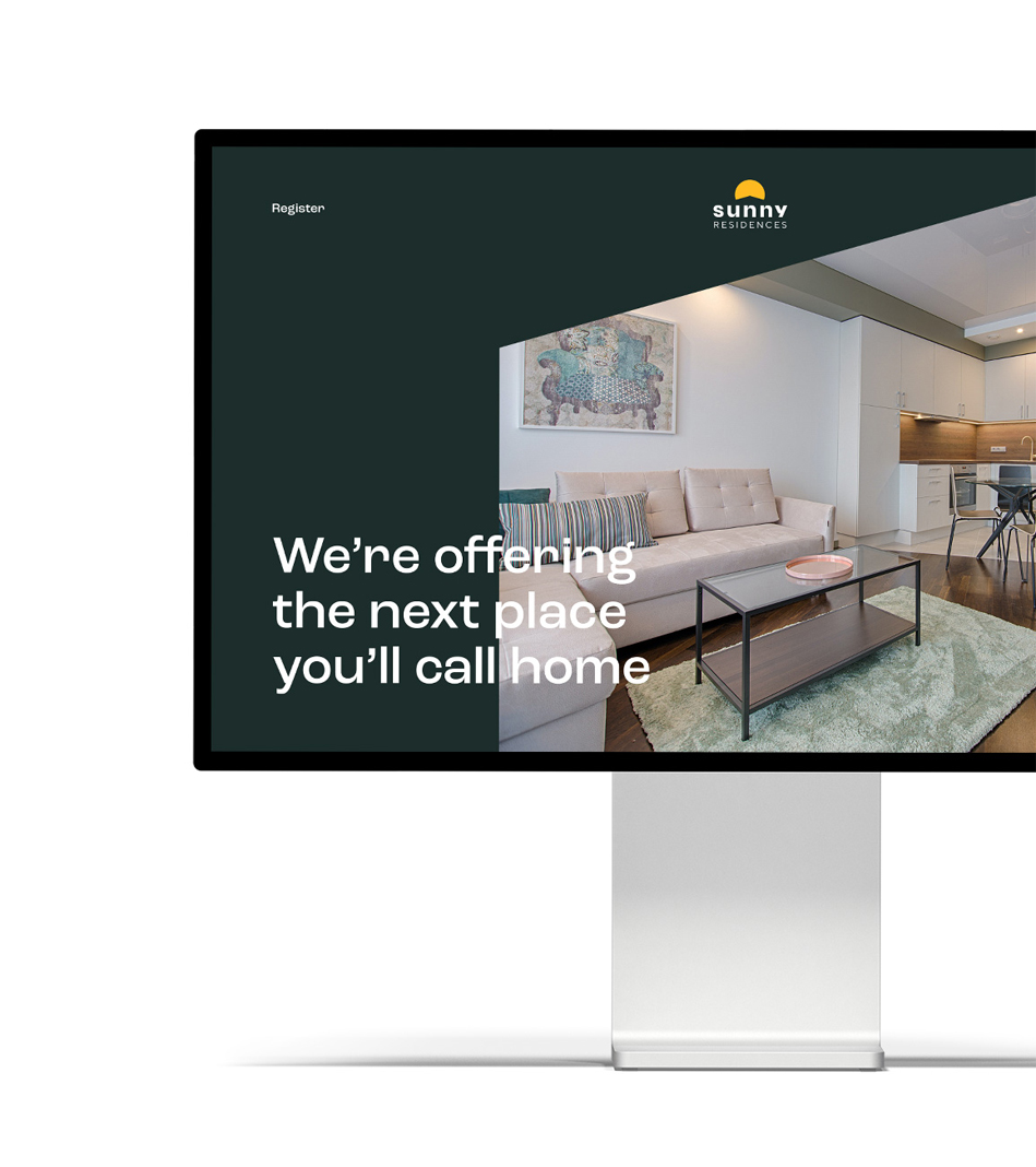
Home is a powerful word. For most of us, it means much more than a physical location. It’s safety, security, stability, and most importantly, love. However, for a place to become home it has to start with the right place. A place that facilitates the development of those kind of emotions.
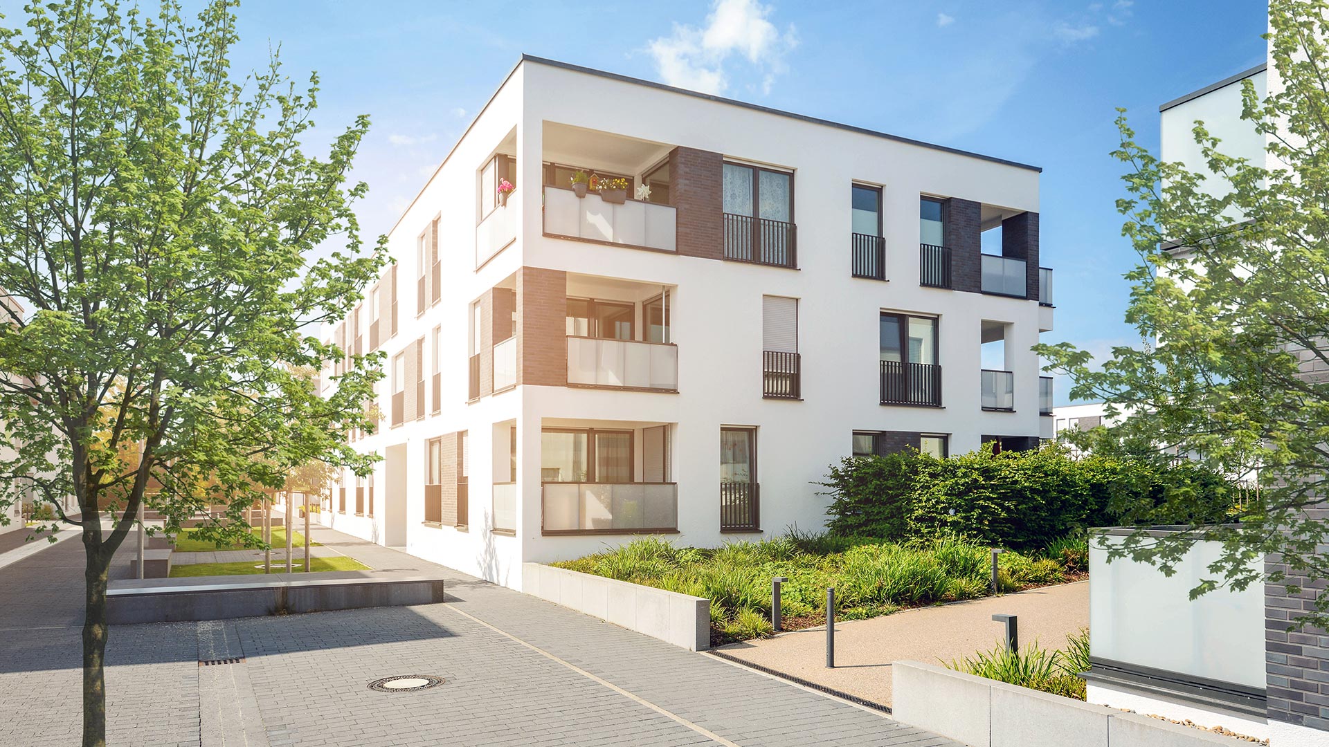
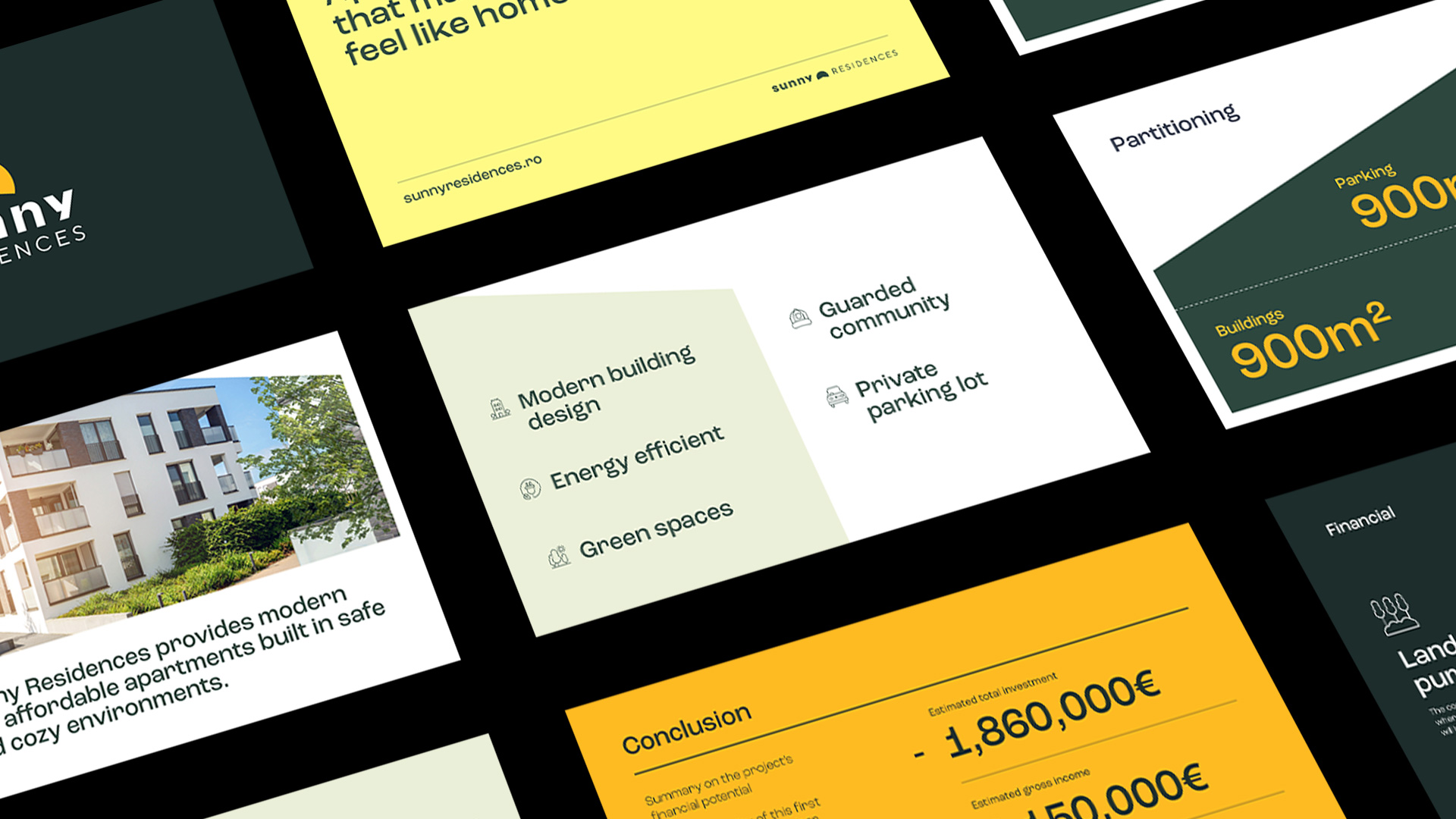
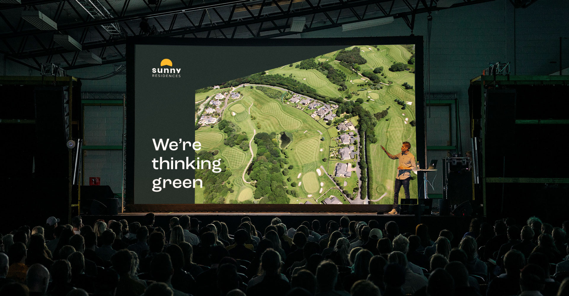
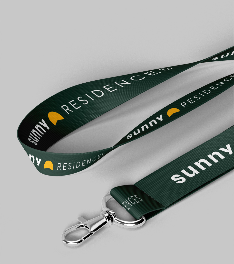
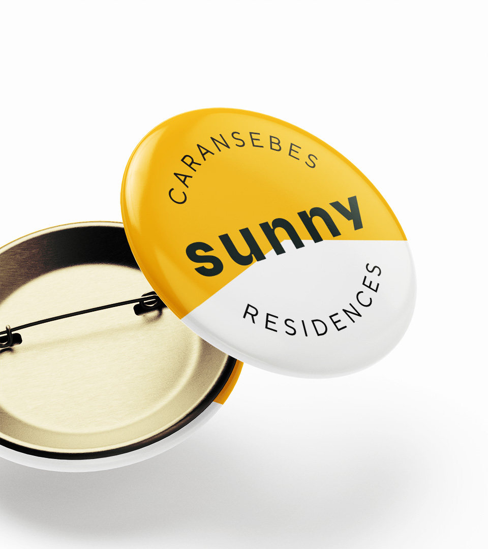
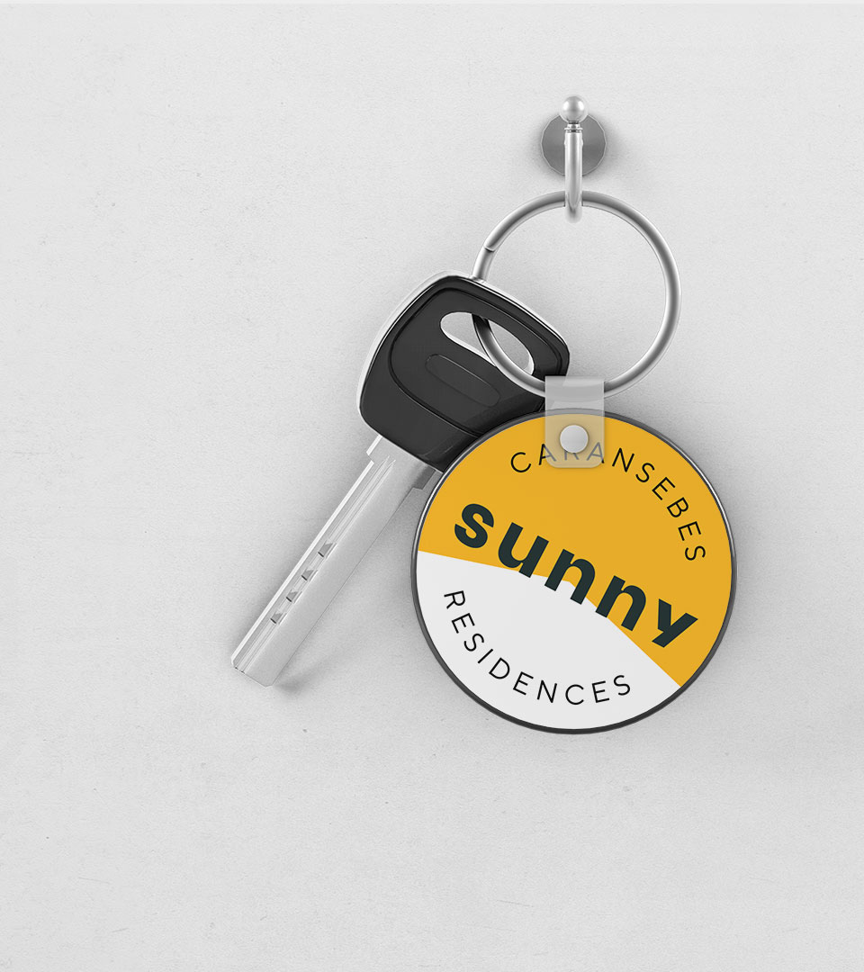
This is where Sunny Residences steps in and promises a 360° experience for its future customers. From the research for the perfect location, buying the land, and raising the apartment buildings, to handing the keys to the lucky owners, providing maintenance services, and community building. Sunny Residences will be born in a small Romanian town named Caransebes, but has national ambitions.
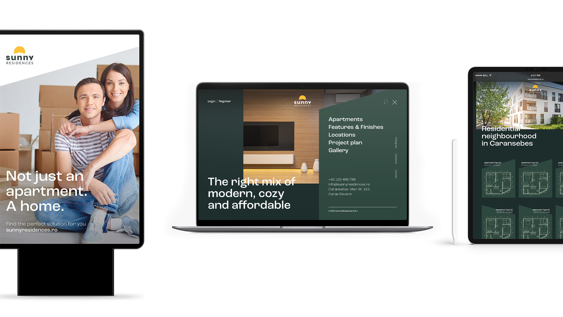
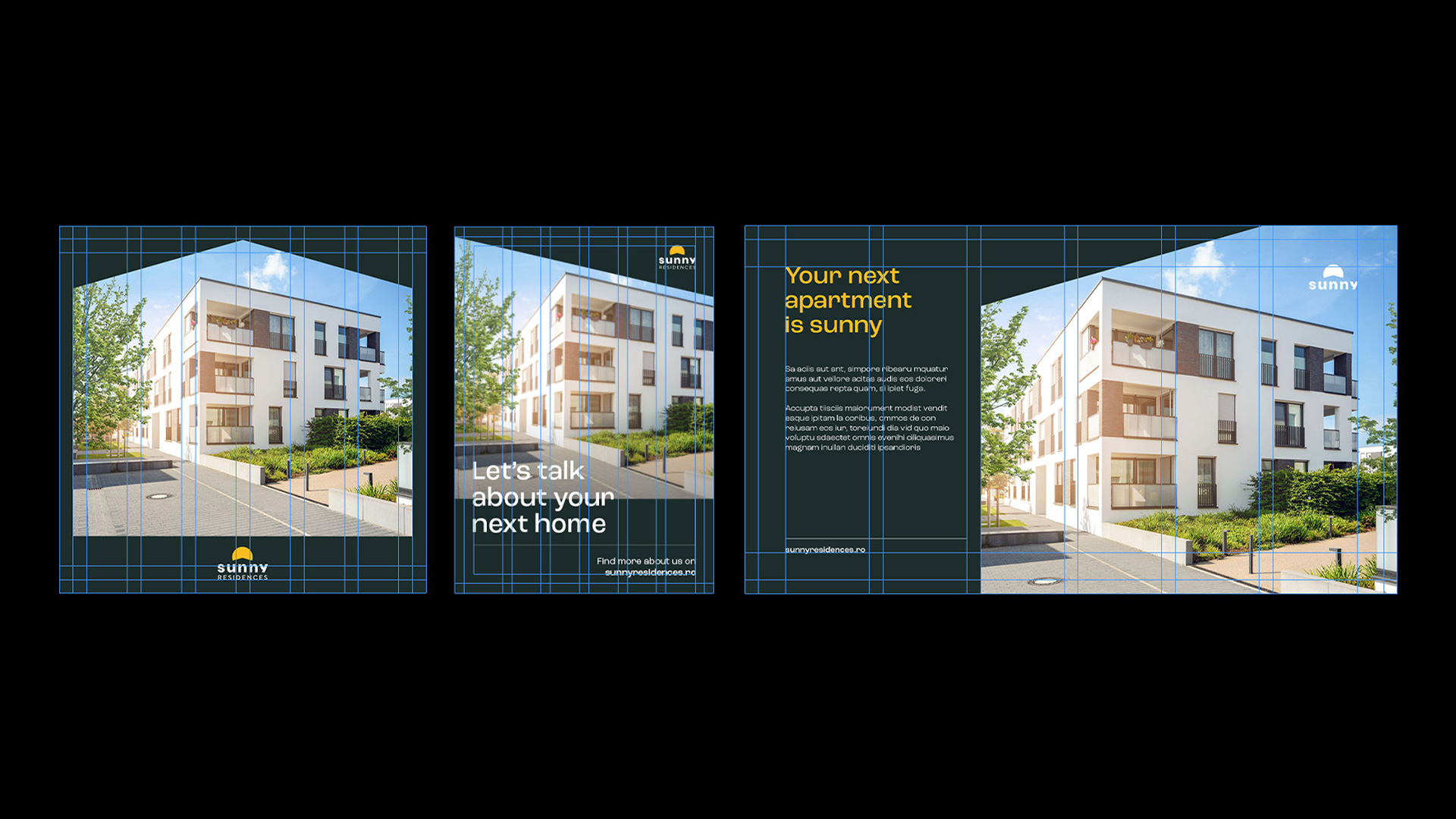
The new brand should attract young families and couples and,at the same time, be scalable and show seriousness and business potential to investors. Their main goals are to secure the necessary funds to start the project and sell the new apartments as fast as possible upon project completion.
Solution
In close collaboration with Sunny Residences’ CEO and key stakeholders, I’ve started developing a brand strategy and messaging that captured the spirit of the brand and set the scene for the the creative direction.
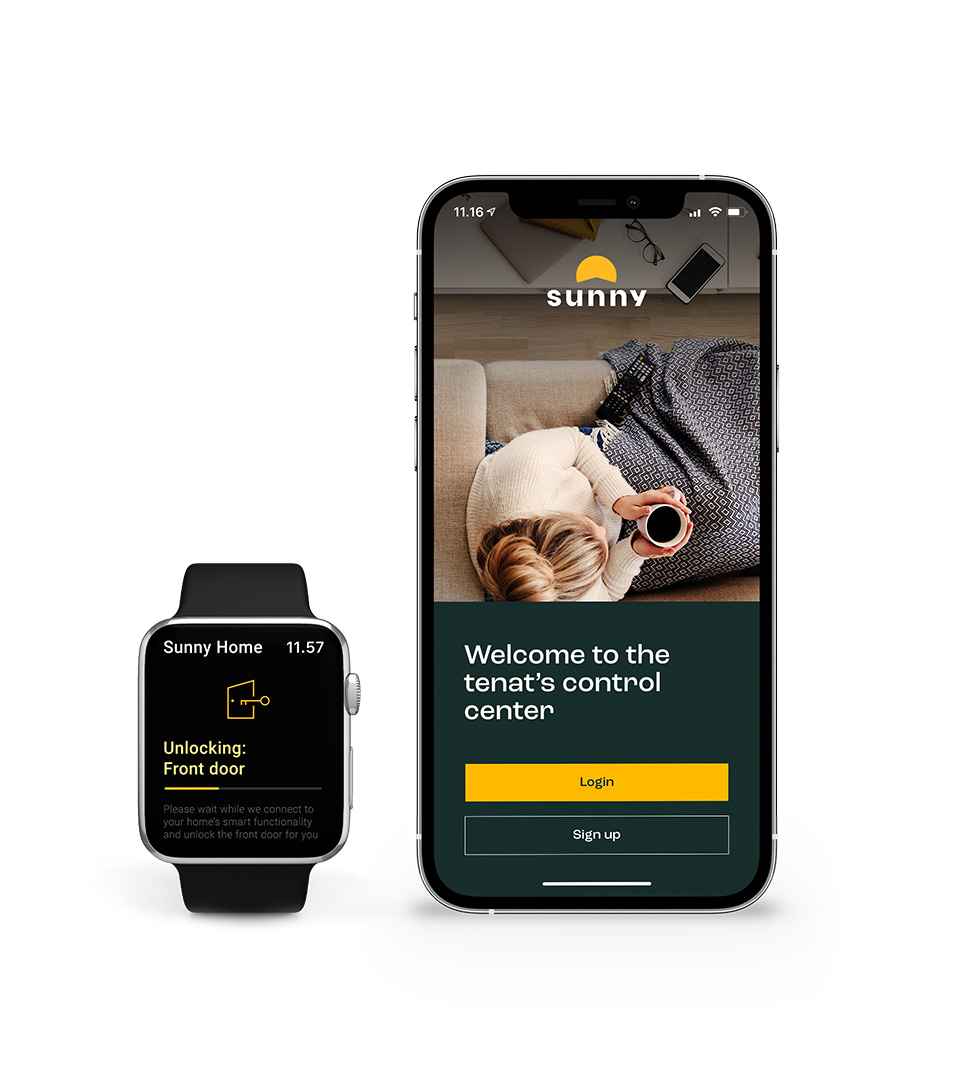
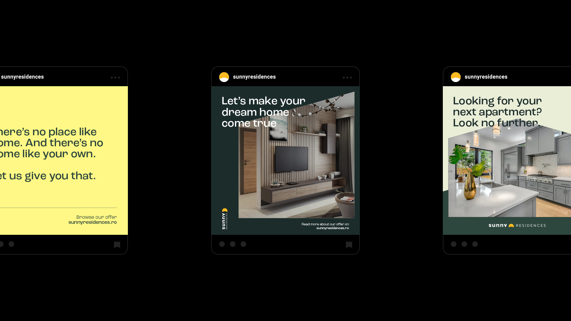
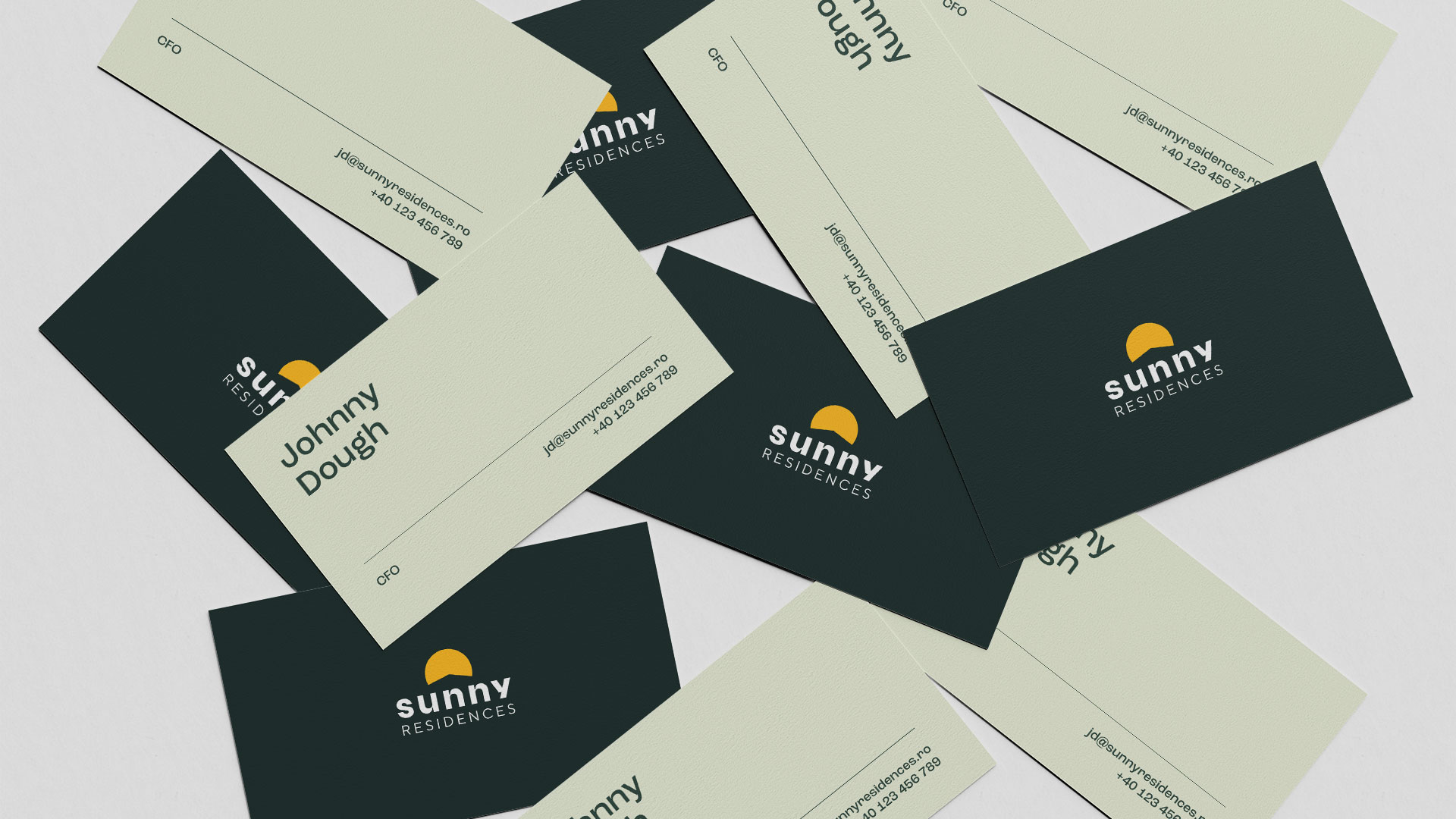
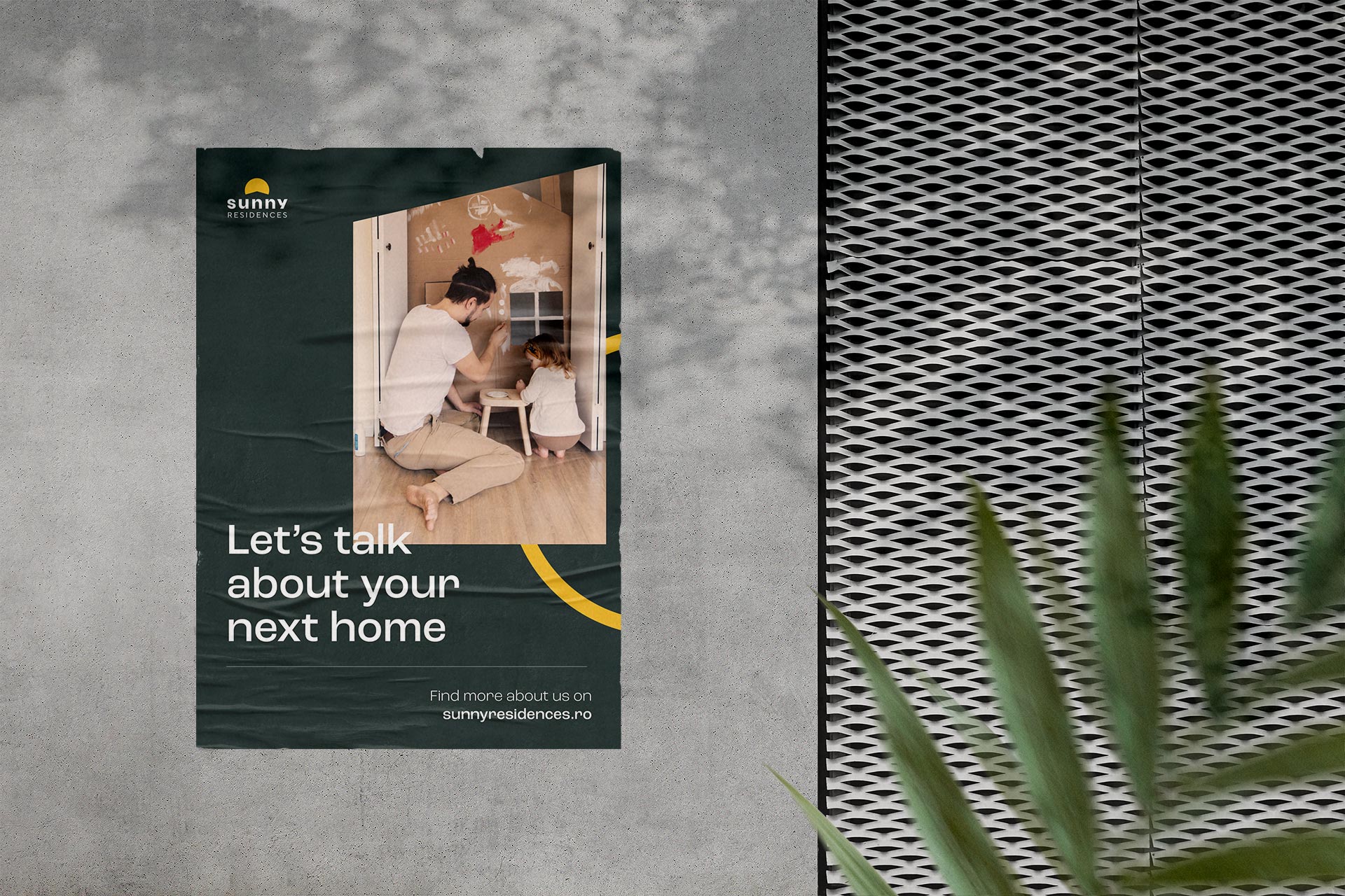
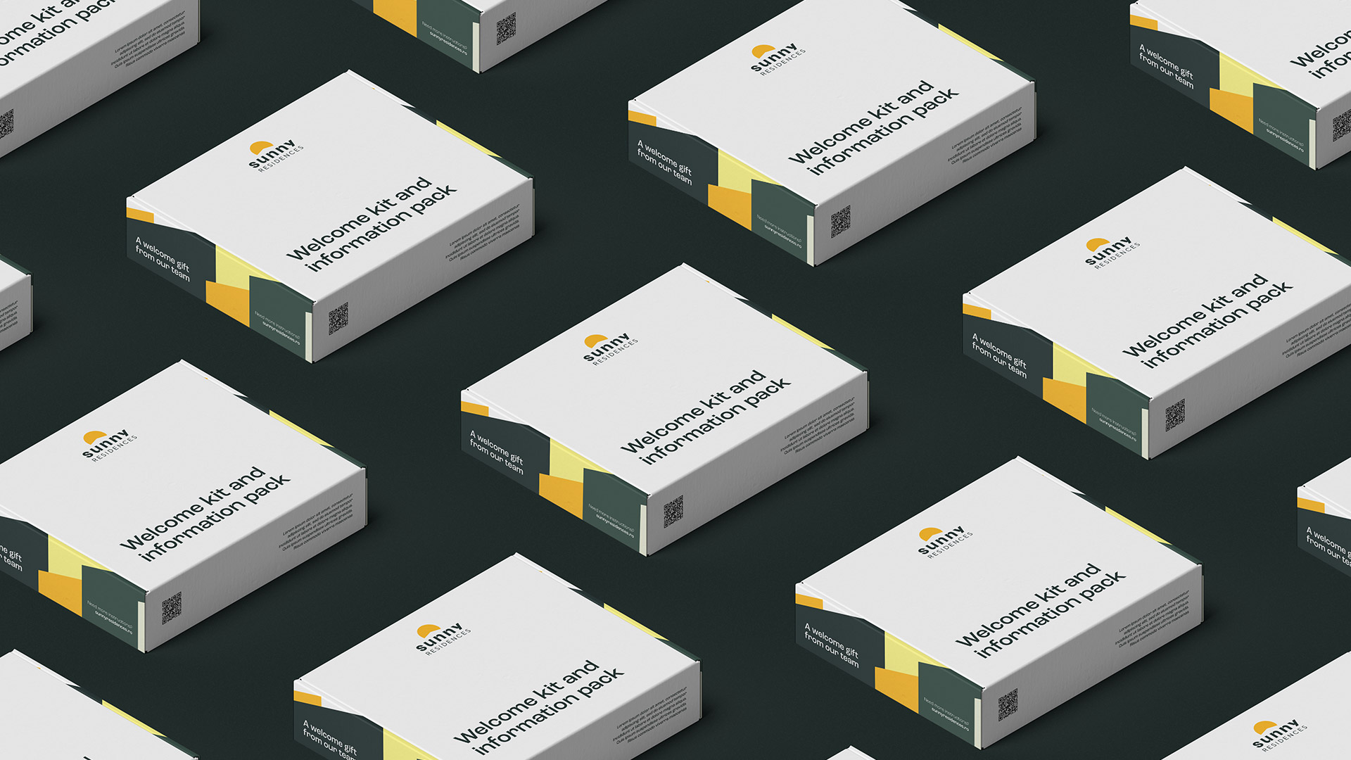
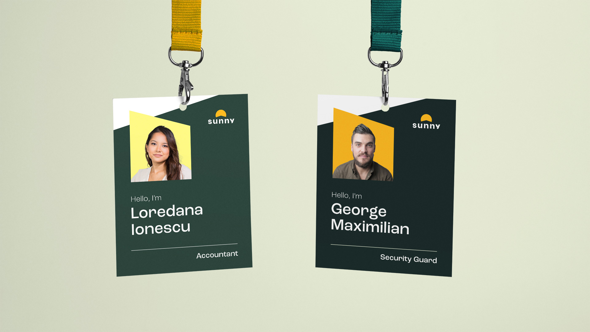
The resulting brand identity and experience positions the company as the new and improved way of buying and owning a home. One that is able to promise very high consumer satisfaction because of the way they operate.